PowerBI + R blog
Visualing Baby Shark doo doo doo doo dooo
February 17, 2019
Nicholas Rougeux is one of my favourite data artists. ‘Cos I am a PowerBI and a R nerd, I was curious if its possible that I can do something similar in PowerBI. At the time of writing this, I wasnt aware if there is a capability to read audio file directly from PowerBI.
I came across this website, the author of this article, Henrik Lindberg, and I shared something in common here, we both admire Nicholas Rougeux and we use R. I’m impressed by the author’s tutorial on how to use tuneR package to extract midi files into tidy data.
I followed his tutorial in R but I chose a different midi file.
SPOILER ALERT - Turn off your speaker now or you will find yourself silently singing along.
So it is the start of the school holiday here in the UK, which means more family / fun time with my 5 year old son - who happens to love singing :) (Un)fornately the song he picked today was “Baby Shark”!!
 ](https://youtu.be/XqZsoesa55w)
# credit to the above tutorial by Henrik Lindberg
library(tuneR)
library(tidyverse)
# read baby shark midi file
df.song <- readMidi('~/powerbi-blog/src/pages/scatterplot-midi-music/baby shark dance.mid')
df.tracks <- df.song %>%
filter(event == 'Sequence/Track Name') %>%
transmute(track, track_name = parameterMetaSystem)
df.notes <- getMidiNotes(df.song) %>%
inner_join(df.tracks, by='track')
df.notes %>%
filter(time < 300000) %>%
ggplot(aes(time, note + track/max(track), xend=time + length, yend = note + track/max(track))) +
geom_segment(size=1) +
theme_void()
df.notes <- df.notes %>%
filter(track_name != 'perc' | note != 98)
# Visualising the plot
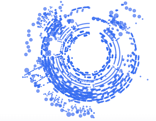
df.notes %>%
mutate(angle = 2 * pi * time / max(time + 1),
radius = 25 + 75 * (note - min(note)) / (max(note) - min(note)),
size = 5 * sqrt(length / max(length))) %>%
ggplot(aes(radius * sin(angle), radius * cos(angle), size=size)) +
geom_point(color="#356DF0", alpha=0.7) +
theme_void() +
scale_size_identity() +
coord_equal()My Baby Shark r ggplot style
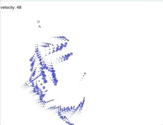
Let’s make it more animated - just like the song!
# Create a new data frame "baby_shark_df" for later use.

df.notes %>%
  mutate(angle = 2 * pi * time / max(time + 1),
         radius = 25 + 75 * (note - min(note)) / (max(note) - min(note)),
         size = 5 * sqrt(length / max(length)))  -> baby_shark_df

# a plot object

p = baby_shark_df %>% ggplot(aes(radius * sin(angle), radius * cos(angle), size=size)) +
  geom_point(color="#356DF0", alpha=0.7) +
  theme_void() +
  scale_size_identity() +
  coord_equal()

library(gganimate)

# this is the library to make an animation.

  p + transition_time(velocity) +
  labs(title = "Rhythm of baby shark: {frame_time}")
PowerBI visualisation
You can visualise a similar visualisation like static ggplot above using standard PowerBI’s scatterplot. I have done something similar here.

I am Nujcharee Haswell (Ped) I do good things with data using PowerBI and R. I am on Twitter